Exploring the properties of the different types of models you can get from training.
As a learning exercise, I trained a small model for a simple binary classification task based on cellular automata. The training data for this task can be easily generated using a simple program, yet the features are pretty noisy, which resembles ‘real’ data in a way. This makes it quite nice as a toy problem, and the results I found reveal the huge variety of models that can be found after training, even when using a constant set of hyperparameters.
The specific problem is this: Given a 128x128 board with the ash created from either HighLife or Conway’s Game of Life (CGOL), the model has to figure out which one is which.
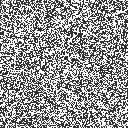
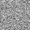
For context, an average soup from both is given here:
A HighLife soup
A CGOL soup
Once everything settles into periodically repeating patterns (could take thousands of steps!), the leftover pattern is called ash. The main differences are the presence of ‘traffic lights’ (those sets of four alternating lines) and ‘honey farms’ (another set of four items) in CGOL and the presence of an unnamed constellation in HighLife ash. There are also differences in the frequencies of the most common patterns. A nice comparison of frequency can be found on Catagolue - Click under root to go to a HighLife haul, CGOL frequency table
At first glance, this is a perfect problem for a CNN to solve.
The model I used has a residual pipeline, and it has been designed in a way such that you can pretty easily swap any two layers, if you are careful about the stride and dilation, as I will elaborate later. This allows for a lot of interesting experiments on how the model changes its internal representations. Also, spatial arrangement and exact distances are extremely critical here, so pooling isn’t a good idea. This is the architecture I am going to work with (in PyTorch):
classCAC_layer(nn.Module):def__init__(self,C:int,r:int):super().__init__()self.seq=nn.Sequential(nn.BatchNorm2d(C),nn.Conv2d(in_channels=C,out_channels=r*C,kernel_size=3,padding=1,stride=2),nn.LeakyReLU(),nn.Conv2d(in_channels=r*C,out_channels=C,kernel_size=1),)defforward(self,input_data):returnself.seq(input_data)classResCNN_CAC(nn.Module):def__init__(self,W:int,C:int,r:int,d:int):super().__init__()self.W=Wself.C=Cself.r=rself.d=dself.embed=nn.Sequential(nn.Conv2d(in_channels=2,out_channels=C,kernel_size=3,padding=1),nn.BatchNorm2d(C),nn.LeakyReLU(),)self.layers=nn.ModuleList([CAC_layer(C,r)foriinrange(d)])self.extract=nn.Sequential(nn.Conv2d(in_channels=C,out_channels=r*C,kernel_size=1),nn.AdaptiveMaxPool2d(1),nn.LeakyReLU(),nn.Flatten(),nn.Linear(in_features=r*C,out_features=1),)self.lossfn=nn.BCEWithLogitsLoss()defforward(self,batch_data:Float[torch.Tensor,"N 2 W W"]):x=self.embed(batch_data)foriinrange(self.d):x=x[:,:,::2,::2]+self.layers[i](x)returnself.extract(x).squeeze(-1)
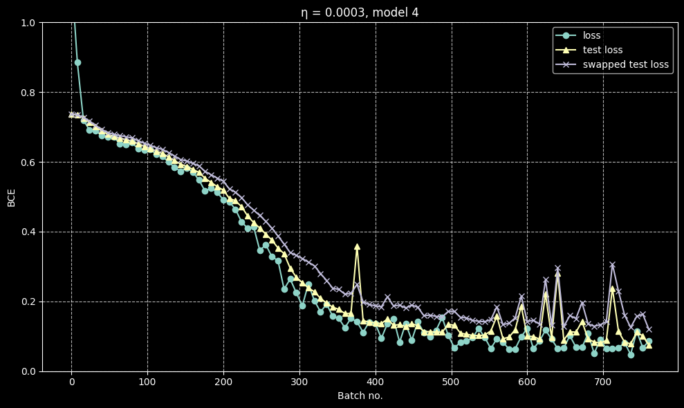
I discovered that this model exhibits a very interesting phenomenon: after a good number of batches of training, when the loss has dropped to approximately 0.4, different training runs diverge in their behaviour. Normal metrics like loss, test loss and error rate decrease normally with no notable difference from run to run, but in a lot of runs, ‘swapped metrics’ (loss and error when the last two layers are swapped) seemed to start climbing after this critical point rather than falling with loss.
A case where they are about the same
A case where they diverge
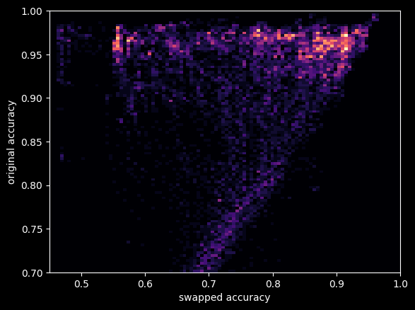
I trained 128 different models on the same data, but with the same hyperparameters. I then chose five of the models which degraded the least under swap and five of the ones that degraded the most for further analysis. Initially, I thought the models formed a binary, but further testing has shown that there is a wide variety of behaviours within each group itself, and swap loss itself forms a smeared spectrum. It is interesting that the other two things I tried, SAE and linear probing, did not have their results correlate much with swap loss.
This is a heatmap for (swap error, original error) for the model checkpoints
So one important note: simply swapping two layers will not work very well. This is because both layers would be adapted to processing data coming from cells at specific displacements, which means that messing with it will give nonsensical results. In order to combat this, I used a technique where I modified each of the layers to act on the full grid rather than the strided version, and to do this, one must apply an appropriate dilation to each layer. This makes the layers more interchangeable and modular, and this is the metric I use everywhere in my analysis. Although strangely, even naive swapping seemed to work moderately well for some models (but worse than the corrected swapping), which I don’t have a very good explanation for.
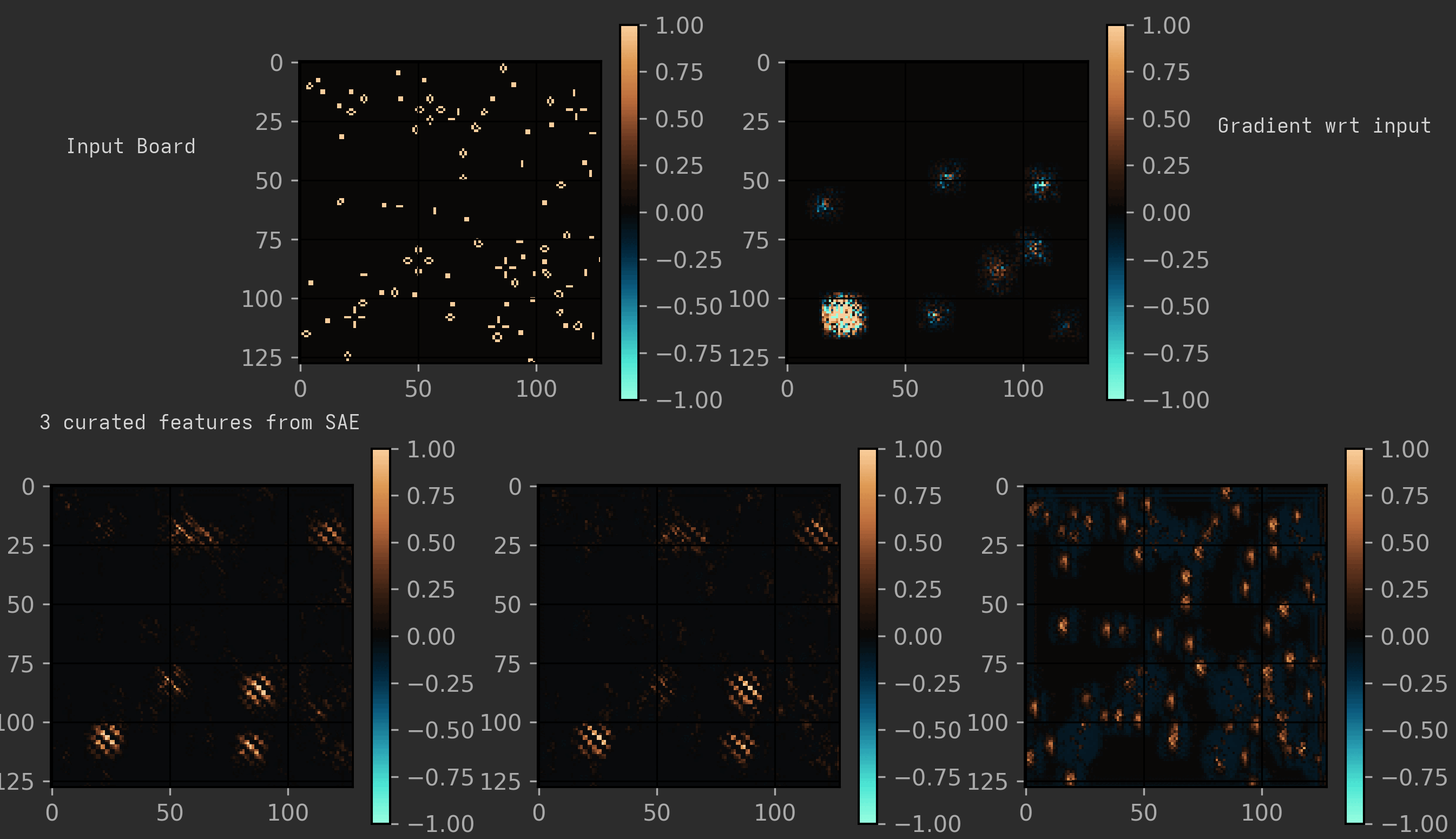
I trained an SAE (Sparse Auto-Encoder) with top 1 and tried seeing how much each model degraded when forced to use it. It struggles in the first layer and does reasonably well in the final two, which does make sense: in the early layers, when you can only see a small area, each cell could potentially be part of a huge variety of structures. But after that, you can basically classify each cell into a specific constellation.
Note: I used an older variant of the model for this, with r=2, but I don’t think the results should change much. They behaved identically to r=1 on most tests, but just ran slower.
The main feature in both models seems to be the same: the presence of traffic lights.
But there are quite a few challenges for any model looking to detect them: traffic lights have two forms, they are quite often damaged, and they can come in all possible grid alignments, which is troublesome for the cells in later layers, as they only see the field in multiples of 2/4/8 cells.
On analysing a middle layer in a certain model, I could cleanly separate out different features corresponding to detecting the traffic light at certain set grid alignments.
(To visualise it nicely, I have shown the expanded version of the model, as described earlier. Also, the features shown here are three of the cleanest I could find; many features were just messier variants of a ‘traffic light at certain alignment’ detector. Another interesting observation is that it seems to treat honey farms as funny traffic lights.)
But another model I analysed just seemed to have one super-feature that had data of all the traffic lights (and sometimes honey farms too) at all alignments and shifts. And this feature seemed to be so powerful that most of the other features were also just slight variants of that feature. Many of the models had a lot of other minor features that were kind of interpretable, but nothing notable. I also remember seeing features capturing things like vertical blinkers. I only analysed two models here, so take these findings with a grain of salt.
Models resistant to swapping seem to be generally more robust to ablating each individual layer, although not uniformly so. And in most cases, for these swap robust models, swapping adjacent layers does better than ablating either layer, which is suggestive of a common representation between layers, and the importance of every layer.
Many models are much less robust to this. They usually just collapse to 40-50% error on any swap or ablation, which suggests that they follow a more sequential architecture.
The weight matrices broadly seem to be similar. We see highly ill-conditioned matrices and other features on both sides of the spectrum. It is interesting how much variety we see on both sides. Also, the extra training I do before detailed analysis usually increases matrix norms, which is expected as the model becomes more confident in its predictions.
Linear probing was done on the average value of the activation vector over all the cells. (I also tried taking max, but that completely flopped)
For most models, linear probing gave good results in the last layer, and poor results in the first one. The middle layer showed more interesting behaviour, with two models showing much higher error rates than the other models.
Model
Original perf
Linear Probe L0
Linear Probe L1
Linear Probe L2
Expanded-swapped 1 2 Error %
3
1.5
16.2
4.7
3.1
48.7
11
1.3
16
18.2
5.7
48.7
38
1.5
10.3
4.3
2.4
11.2
67
2.1
10.8
3.4
2.6
40.6
84
1.6
16.2
3.2
4
51
100
2.1
10.9
4.3
3.4
46.9
102
1.7
13
3.6
1.6
48.7
107
1.6
10.2
3.8
1.9
7.1
112
1.1
18.4
16
4.7
15.4
117
1.3
10.9
3.6
2.4
4.2
We can extract a vector from each linear probe’s weights. You could think of this vector as the sort of direction corresponding to the feature of highlifeness. I tried creating a cosine similarity matrix from these to see how common the representations were. This showed some interesting observations, with layers with similar linear probe error rates showing higher similarity, and overall, the cosine similarity tended to be positive. But there were a lot of oddities and exceptions, so it’s best not to come to any conclusions using this.
From my experiments, I haven’t really found any better hypothesis than that the model just sometimes randomly decides to either share or not share a common representation of the core features between layers at the critical point, depending on the initialisation.
For the record, my initial hypothesis was that there were two types of models, as classified by their swap loss, which had unique behaviour under other analyses like SAE and linear probes, too. But further testing has convinced me that such relations do not hold, and that most of my initial results were quirks of the specific models I happened to get rather than general phenomena. And that there aren’t two well-seperated classes, but a spectrum.
This also tells us that the model and the problem are complicated enough that two random models vary along several unrelated axes.
From exploring the SAE, my conclusion is that all the models have learnt basically the same thing: the rule is determined by the exact density of traffic lights (and honey farms?) compared to the total density of objects.
It is also interesting how the model seems to focus so much of its effort on traffic lights and has learnt to collapse both TL phases (and honey farms) into one feature. This was unexpected, as I thought it would also use honey farms and highlife constellation as a separate feature, but in hindsight, it makes sense that it would devote so much of its capacity to ensure that no TL, regardless of phase/position/damage, would go undetected.
It seems interesting that there are so many distinct basins of behaviour arising from the exact same training data. I haven’t tried doing this for other models to see if this sort of split is observed even there, so this behaviour may be unique to the idiosyncratic architecture I have been using.
Many aspects of this toy model remain unexplained, like what exactly is the computation occuring at each layer of the model.
I should’ve used a multi-classification task (maybe with B3/S23, B36/S23, B38/S23, B3/S238, etc.) rather than a binary problem. This would’ve made a lot more interpretability techniques accessible and testable.
Aside: I just re-read my older posts and realised how bad I am at writing for an audience made of people other than myself… I am actively going to try and use less jargon from now on…. But unfortunately this series of posts would become wayyy too long if I try writing it for a general audience, so some jargon is inevitable.
Note: while doing the research for writing this post, I stumbled upon this paper: Michael Creutz , “Deterministic Ising Dynamics,” Annals of Physics, 167
(1986) 62-76. What the author tries to do there is actually very similar to what I am doing! They also design a purely deterministic CA to simulate the Ising model. But they seem to have taken a different approach, where instead of having a single giant heat bath separated from the main Ising arena, they couple a tiny heat bath of capacity 3 to each cell. This is actually… a really elegant idea. It requires only 16 states, and there is no need for a separate heat bath. I still feel my method is much more fun, as it seems much more like a physical material, and this allows you to measure a lot of interesting quantities like thermal conductivity, by sandwiching it between two baths, similar to how you would measure it for a real material.
In the last post, we saw how thermodynamics in general works in CA. Now, we will specifically look at the Ising model.
This one is not actually my invention; it has been explored by some famous names in cellular automata, e.g. see page 4 here. It has two states, ‘up’ and ‘down’. The rules are pretty simple:
We will only update a cell if the following two conditions are met:
is even (i.e. the updates follow an alternating chessboard pattern)
The state flips if there are exactly two adjacent up and two adjacent down cells
This conserves energy according to the definition of energy in the Ising model, as the number of adjacent up-down pairs is always constant.
It also happens to be reversible. The reverse rule happens to be itself, with the checkerboard flipped. To see this, what we do is apply the rule without flipping the chessboard pattern. Because of the chessboard pattern, the number of neighbours of a particular colour for each changed cell remains the same, and so the exact same cells get flipped again. Hence, the step gets reversed.
As we know that this rule is both reversible and energy-conserving, we can apply the principles of thermodynamics here.
But, here, a problem is that, unlike the previous case, we cannot assume all the energy locations are independent, so there is no obvious way to determine the temperature. But the same definition still works: The energy needed to increase entropy by one unit.
To actually measure the entropy, there is a known formula, but it is very complicated. And the formula can be found only after you find the exact solution to the model, so I think it’s cheating to use that. That is why, to actually work with temperature, we couple it with a system whose temperature can be easily calculated.
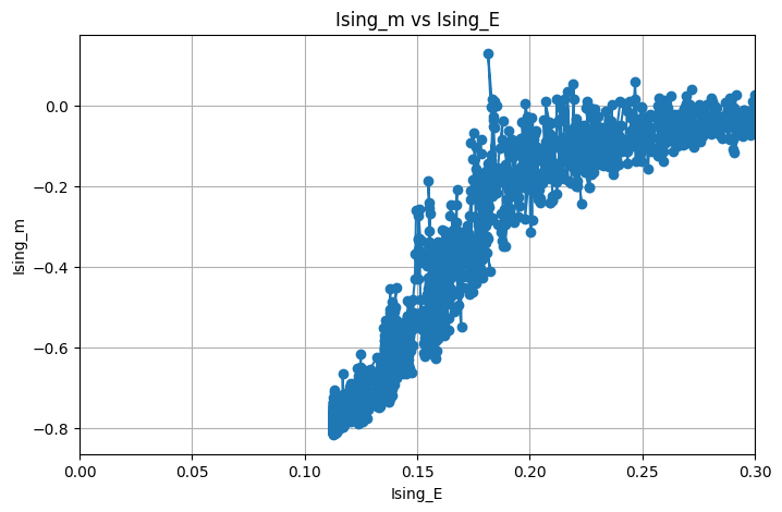
Now, you can use this even without a heat bath to calculate the graph between energy density and magnetisation. Here is approximately how they would look (I got lazy, these are the graphs when it is coupled to the heat bath with slow energy loss, but they should look the same)
Some observations:
I cut off the graph at low energies. This is because the system starts to get ‘frozen’ and hence energy transfer becomes too slow. So you would have to wait for an impractically long time in order to reach equilibrium.
You see that
drops drastically between
and
. This is where the phase transition happens!
It is extremely noisy and not smooth. To get a properly smoothed graph, we will have to take multiple samples at each energy level and do some averaging. This is STATISTICAL mechanics, so nothing is absolute; everything is always fluctuating.
It gives the expected results, but the phase transition is not very satisfying to watch. To see a proper one, we will need to move on to designing an interface between our heat bath and our Ising CA.
The interface consists of a row of cells that can carry energy both in the form of HPP energy packets and Ising bonds.
The big picture idea behind its evolution is very simple: In every step where it is active, it interconverts energy between its Ising form and its gas form. I’ve tried to make this visible through the icons given to each state.
The only problem is that we must respect the chessboard update pattern, reversibility, and all the conservation laws.
Proving this manually for every CA transition rule is not easy, as there will be a lot of states because the two CAs have pretty different ways of conserving energy, and this means it is not straightforward for the interface to conserve energy. Hence, to simplify matters, I decided to divide every step of the CA into two substeps:
Energy movement
State permutation
The movement of the HPP gas and the Ising spin flip both happen under step 1. The HPP reflection rule, interface energy transfer and the chessboard alternation all happen under step 2.
By ensuring that both steps satisfy energy conservation and reversibility, we can prove the final rule does so too, which makes enforcing these much simpler.
The proof of reversibility and energy conservation of the first part can be directly copied from the same proofs for HPP and the Ising CA.
For the second step, note that all possible energy transfers are compulsory, so when doing it again, the energy just gets transferred back.
So that is it! The interface has been successfully designed, and now we can move on to analysing the behaviour of the final system in the next post.
To actually run the CA, we have to specify it in some standard format. The CA rule format accepted by most CA software is the rule table.
In this format, rules are specified as transitions. For example, the line
0, 0,0,0,0,0,1,1,1, 1
signifies that a 0 cell with exactly three 1 neighbours turns into a 1.
It also supports variables, which allow you to compact multiple transitions into one line.
Unfortunately, it is a pain to write manually, so Nutshell was created. Nutshell adds several helpful features, like independent variables and temporary symmetry switching.
While designing the rule, the number of nutshell transitions also turned out to be pretty large (54), so I decided to write a Python script to generate the transitions for me. It also allowed me to properly incorporate the 2 step way of thinking about the rule that I had described. It also makes debugging and iterating much simpler.
So in the end, to generate the rule file, you have to run my code and then copy-paste the output into a template. This template would contain the rule name and the icons for every state. Then we have to compile that using Nutshell. And then paste the output rule file into Golly. Which turns out to be an extremely convoluted workflow….
A lot of the complexity arises because energy conservation and reversibility are not natural concepts in the rule table format. Another complication is that the symmetry obeyed by the HPP gas involves a rotation and a state permutation, so it is not natively supported anywhere. So you have to manually specify all four directions separately.
I love fractals! Mostly because I think they look really pretty, but also because they show us how much detail and complexity is hidden even in the simplest math.
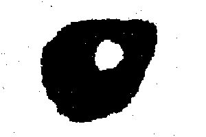
Recently, I was trying to learn about heuristic algorithms. These are algorithms that don’t always give the best answer, but they are usually much faster and easier to run. I thought that trying to find fractals that are as intricate as possible sounds like a nice problem to try, as it is very hard to go through all possibilities. Here are some samples of the results I managed to get: (Hopefully my colour palette isn’t too painful to look at)
These fractals are all part of a family of fractals, very similar to a famous fractal called the ‘filled Julia set’. To understand what the image shows, we have to choose a function
This takes in a point from the X-Y plane and returns another one. We plot the X-Y plane into the image with some scale, then we repeatedly apply this function (i.e. find
) to every point of the image and see what happens.
We shall call the sequence of elements
the ‘iterates’ of p.
In the preceding images, green represents the points whose iterates converge to zero, black/blue represents the points whose iterates keep getting bigger and red represents those doing neither (as far as the program could calculate). The brightness is how many times
was applied before the program could determine its behaviour.
The function
is determined by 10 numbers
. It is very hard to find a good set of numbers, as most choices just lead to boring blobs or just emptiness. So, these numbers were determined using an algorithm called simulated annealing, which basically tries to mimic how nature seems to find good solutions by randomly jumping around. The objective it tried to maximise was basically the number of pixel changes at boundaries, i.e, it tried to make the boundary between the two regions as large as possible.
There is a famous family of fractals called filled julia sets, which are related to another fractal called the Mandelbrot set. Some filled Julia sets are associated with the main heart-shaped region (i.e. cardioid) of the Mandelbrot set. It is interesting that these are a subset of our family of fractals, but they tend to look very different.
You can find the code I used to create these images here. You can run it to try and create more such fractals (Also, it allows you to zoom in and out). I thought of embedding it here using Emscripten, but it ends up being insanely slow on the web.
Some interesting technical challenges I faced:
I actually considered the more general 12-parameter functions with constant terms, too. This includes famous fractals like the Hénon map. But I encountered a frustrating issue where there would be fractals that seemed to look intricate to my SA due to the limited number of iterations, but were actually just empty because there wasn’t any attractor (i.e. all the points were black)! Another issue was that there was no fast way to determine convergence other than waiting and hoping everything else goes to infinity. To fix these, I just decided to limit myself to functions with a fixed point at 0.
How to determine if a point is going to converge to zero?
We can find out if points close to 0 always tend to get closer by calculating something called the Jacobian matrix of the map at 0. If all the eigenvalues of this matrix satisfy
, then it is attracting. The reason this works is actually pretty clever; the idea is that near the fixed point, the function behaves like its Jacobian. You can usually decompose any vector as the sum of two eigenvectors, and if all the eigenvectors contract due to the mapping, it is apparent that their sum should also go to zero.
Using the previous proof to find a lower bound for the radius of the region where all points definitely converge to 0 is not trivial. You have to take care of the fact that even though the function might be squishing points towards 0 overall, it could temporarily cause some nearby points to go farther and take this into account when bounding the quadratic terms.
Some fractals looked too ugly and dusty. I tried fixing it using a Gaussian blur, but that just made it look smudged. After trying a few techniques, I felt that median blur seemed to look best.
This family of maps actually includes a lot of fractals called strange attractors, and what appears to be non-chaotic ring-shaped attractors, but due to how my visualisation works, you unfortunately cannot truly appreciate their beauty here. I actually want to try to explore the ring attractors and how they deform into strange attractors as the parameters continuously change, because that is something I have never seen before.
The Ising model is a famous model of phase transition in a ferromagnetic material. It can be simulated using many methods, famously MCMC methods, leading to pretty looking simulations like this one:
This basically uses a randomized method that ensures that the generated grid is sampled from the probability distribution we would get if we coupled such a system to a heat bath. The Ising model doesn’t really have any inherent dynamics. The only fixed thing is the energy of each state and the Boltzmann distribution. The main problem with directly trying to port such a simulation to a cellular automaton is that we do not have any way to do a probabilistic action as CA’s are completely deterministic. Also, this system does not really conserve energy, and if I really wanted to do physics using CA, I want it to at least try and imitate real life physics.
Well, thermodynamics usually makes no sense in a CA context. What is energy? Temperature? The stereotypical example of a CA, Conway’s Game of Life, has pretty much no conserved quantities. It also doesn’t have time reversibility. So it is a pretty bad model of physics and so thermodynamics makes no sense here.
In order to actually have a sensible notion of thermodynamics, we will have to design a CA with these properties:
Time reversibility
Presence of some conserved quantity
Chaotic behavior
Lucky for us there already exists a CA with these properties… behold! the HPP lattice gas!
If you have heard of HPP before, you might be thinking that this makes no sense. HPP is a model of a fluid, and since all particles have the exact same average kinetic energy, you might think that every configuration would have the exact same temperature.
In order to tackle these problems, we will have to properly define and reinterpret things. In the following sections, we will think of each particle of the HPP gas as an ‘energy packet’. Hence, conservation of energy just becomes equivalent to the conservation of particle number. We shall consider one particle to be one unit of energy.
The HPP lattice gas happens to be its own time reversal under a simple state transformation, which proves its reversibility. And visually, it seems chaotic at high enough densities.
Now, consider a box with some volume and with some number of energy packets. In this context, now how do we define temperature? To do this, let us introduce another important concept in Statistical mechanics: Entropy.
Entropy, using the most basic definition is this:
where
represents the probability of a certain state
.
Now, I will be taking a huge leap of faith and assuming the following: HPP behaves completely randomly after a small amount of time, i.e. every possible state with the same energy is equally probable.
There are a few reasons why this isn’t completely unjustified (like reversibility) but as of now, I have no idea how to prove it in a fully satisfactory way and I am not sure if it is even true. But making this assumption will help us simplify our calculations.
Taking the above statement as a postulate, we get the following expression for entropy of a
(as each square holds at most 4 particles) board with
particles (I will be ignoring edge effects and assuming
)
Now, we may ask, does this entropy have the same behaviour as in our world? Does total entropy of a system always increase with time?
As a thought experiment, consider connecting two boxes with different densities. Let us take the total entropy to be the sum of the entropies of the two boxes. With time, we should expect the density of both boxes to go to the same equilibrium value.
A straightforward calculation will tell us that the completely uniform state happens to be the maximal entropy state. Hence the second law of thermodynamics seems to hold here! This should not actually be surprising if we understand what entropy is measuring and why it always increases in a system.
Consider there are
boxes, each with entropy
. Assume that we do not know anything else about our system, hence the total set of possibilities
has cardinality
Imagine that after some fixed, but large number of steps, it almost surely results in some state
with some entropy
. Since we assumed that all that the elements of
result in some element of
, hence the evolution of
for
steps is a subset of
. Because the dynamics of HPP are bijective, this means that
Hence, we have shown that entropy cannot decrease in all the cases. This derivation can be adapted to bound the exact maximum probability of a certain entropy decreasing transition.
Interestingly, due to the reversibility of HPP, it is actually very easy to construct specific magic states that actually violate the second law, for example (The magic happens around
):
But this does not contradict our derivation, because our results should hold only if we know nothing about the system other than its macroscopic properties. An analogous result holds for the real world, there do exist such weird states in classical mechanics but due to chaos theory it is pretty much impossible to build such a second law violator in real life.
Now, we can move on to define temperature. The most fundamental definition of temperature is the amount of energy needed to change the entropy of the system by one unit. To me, this is a very beautiful definition as it immediately makes it clear why energy must always flow from a hot body to a cold one: due to the second law! Let us consider a volume V container with density
as before. Imagine one packet of energy is inserted, i.e.
. Then,
So the temperature,
Which is interesting as it only depends on the density. On reflection, this should make sense: Temperature is an intensive variable, so it shouldn’t depend on the size, only on the density of the chaos.
One funny thing you might notice is that temperature here isn’t actually strictly positive: when the density exceeds 50%, entropy decreases with gain in energy. This concept of negative temperature is actually well known, but is very rare in real life. And these states behave as if they are hotter than infinite temperature. For this reason, in some places, I will prefer to use thermodynamic beta instead, which is much nicer to work with and is just the reciprocal of temperature in natural units.
In order to set up a CA we need a heat bath. So why not use this as a heat bath? Unlike the Ising model, we have an extremely simple formula to calculate the temperature, so we can try and couple it with the Ising CA and use it to calculate temperature. The key insight is that the laws of thermodynamics must hold regardless of the exact details of the coupling, as long as we respect reversibility and energy conservation.
This is extremely vague for now, I will expand upon more details of how exactly we are going to simulate the Ising model and how the coupling works in my next posts. For now, you can play around with final rule and try to figure out how it works.
 A case where they are about the same
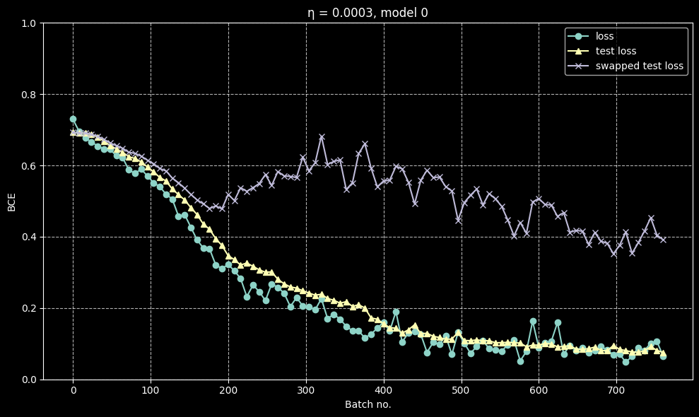 A case where they diverge